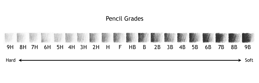
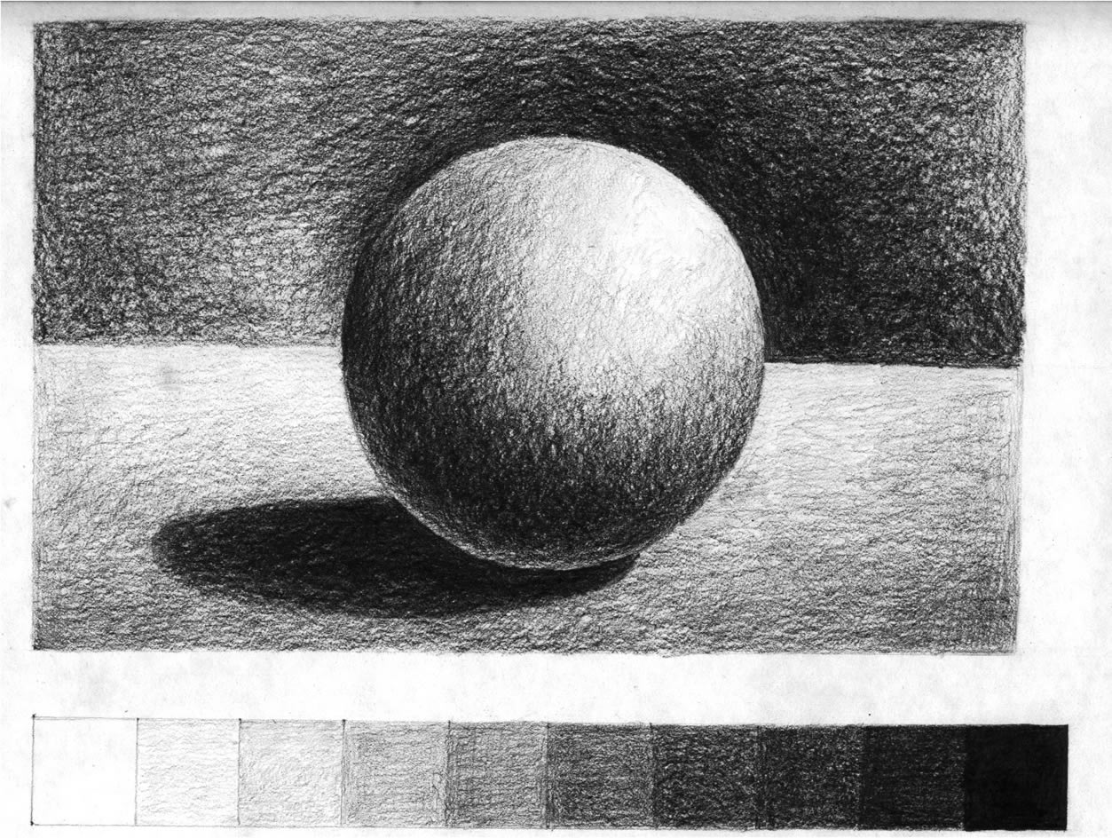
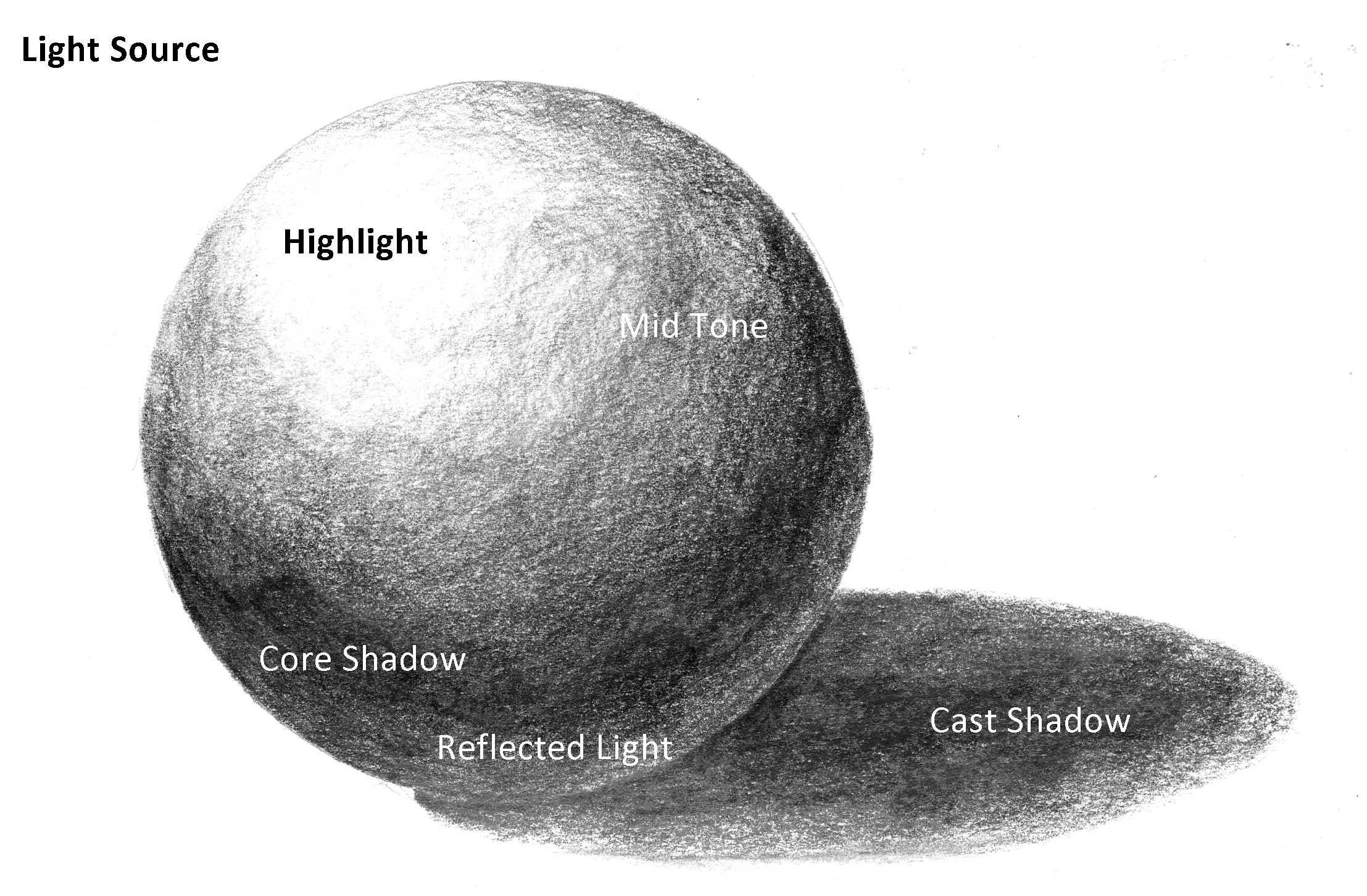
Gradient is the seamless transition between values. If you create a smooth gradient, you won’t be able to see any dividing lines between your darker and lighter values. Below is an example of a smooth gradient. It moves gradually from dark to light.

What I’d like you to do today is to create a line drawing on a piece of paper. This drawing doesn’t have to look like anything at all; it could only be patterns. But make sure that you create a lot of different lines, so that you end up with a lot of different spaces to work with.
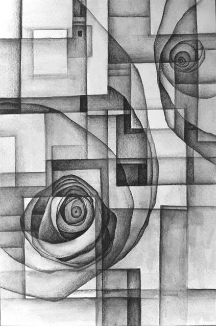
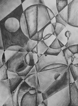
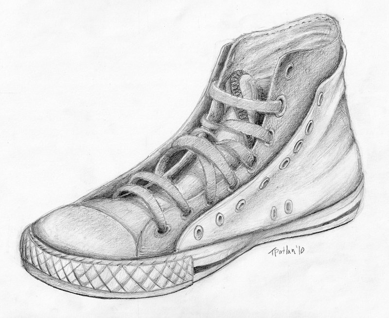
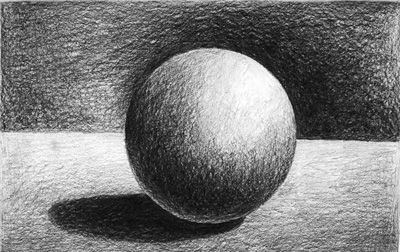
An example of a line drawing, with added gradient.
After you create your line drawing (these are sometimes called “shattered” drawings), you will begin to work with gradient in each of your different shapes or areas. Try to go very smoothly and gently from dark to light in each area. Please remember to use the whole value scale (light to medium to dark), and please remember to use different pencils in order to achieve the best results.
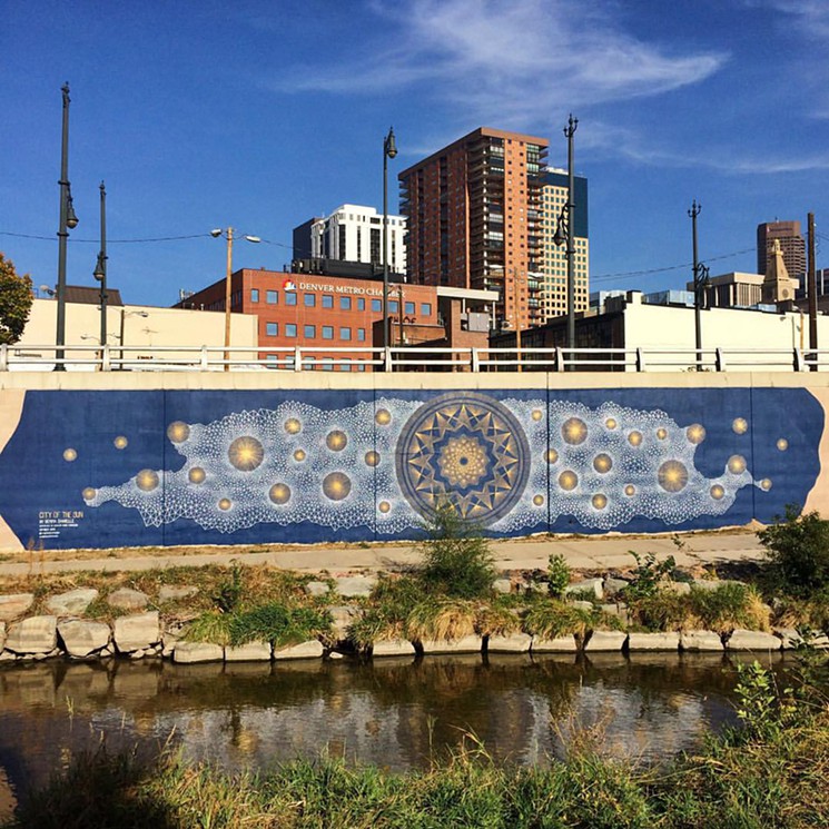
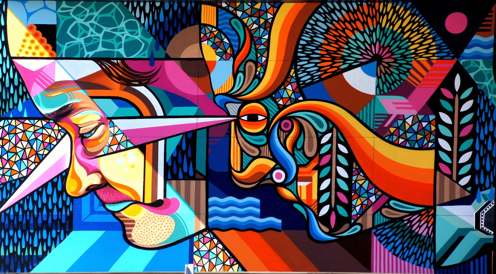
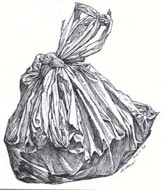
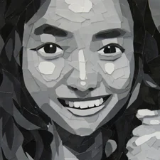
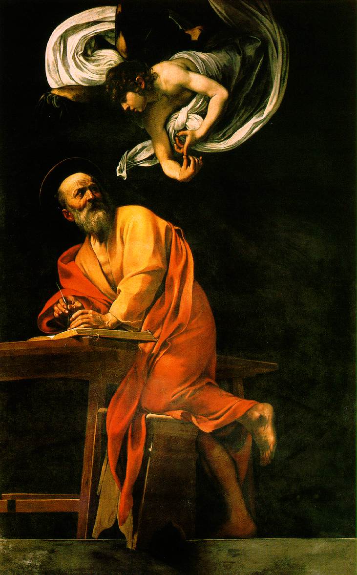
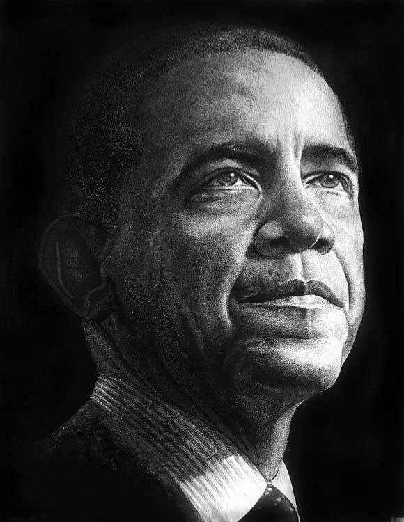
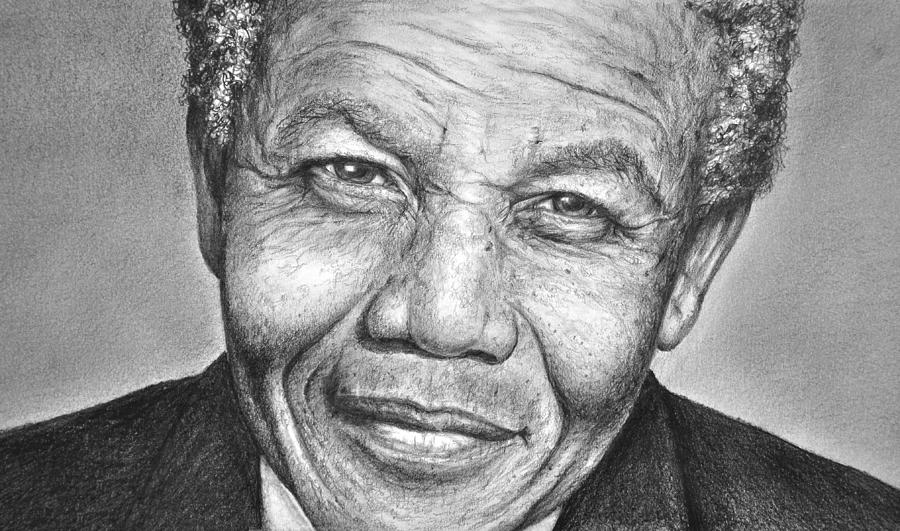
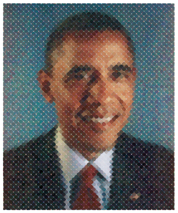
There are many more examples below. Do your own thing and have fun with this assignment!